Select this license type when you are developing an app for iOS, Android, or Windows Phone, and you will be embedding the font file in your mobile application's code.
BoRock
by Fontforecast
Individual Styles from $19.00
Complete family of 2 fonts: $29.00


BoRock Font Family was
designed by
Rob Versluys and
published by
Fontforecast. BoRock contains
2
styles and family package options.
More about this family
- Aa Glyphs
-
Best ValueFamily Packages
- Individual Styles
- Tech Specs
- Licensing
Per style:
$14.50
Pack of 2 styles:
$29.00
About BoRock Font Family
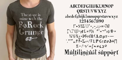
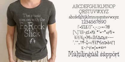
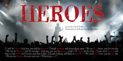
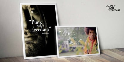
BoRock is a handcrafted font that comes in two pigheaded styles, inspired by the rock music scene. You can use BoRock instead of the usual neat serif fonts. BoRock Grunge is a rough crispy serif font, excellently suited for use in both display and body text. The BoRock Slick is what the name implies, a more smooth serif font, ideal for use in body text, but also suitable for titles and headings. You can use BoRock Grunge and BoRock Slick for magazines, advertising, T-shirts, posters and so on. By activating Discretionary Ligatures and typing _1 to _9 and *1 to *8 you can get your hands on some nifty bonus symbols. So get creative with BoRock and the stage is yours.
Designers: Rob Versluys
Publisher: Fontforecast
Foundry: Fontforecast
Design Owner: Fontforecast
MyFonts debut: Aug 18, 2016
BoRock
About Fontforecast
Hanneke Classen started Fontforecast in 2013 as a label of Storm Creative Consultancy, an advertising agency where she works to this day as a graphic and type designer. “Working with fonts as a designer day in, day out made me curious about the process of designing fonts,” she says. “As soon as I dived into the ins and outs of font design, I was hooked.” It was in that same year that she finished work on her first two font families: Tyfoon Sans and Tyfoon Script. “The concept was to combine two very different designs in such a way that they work together well. By using the same measurements as a skeleton for both font families they became interchangeable, even in the same sentence, without causing leading problems.” “The concept of making font families consisting of different designs especially made to complement and support each other was relatively new at the time Fontforecast started,” Hanneke says. “My aim is to give all of my font families a certain something extra.” This drive to push the envelope gave way to bestselling typefaces Chameleon, a design kit of 16 fonts intended to bring a personalized touch to any project, and Salt & Spices Pro, a modern collection of 9 calligraphy fonts that brings to life an authentic feel of vintage dip pen calligraphy. There is much to look forward to in the future from the Netherland-based foundry. Marloes Versluys, an Amsterdam-based art director, graphic designer and type designer, is joining the foundry and working with Hanneke to continue making a wide variety of typefaces perfect for any, and all projects.
Read more
Read less
- Choosing a selection results in a full page refresh.