Select this license type when you are developing an app for iOS, Android, or Windows Phone, and you will be embedding the font file in your mobile application's code.
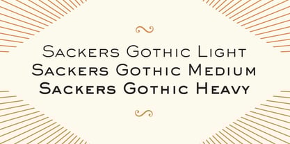
Sackers Gothic™
by Monotype
Individual Styles from $32.99
Complete family of 3 fonts: $79.00


Sackers Gothic Font Family was
designed by
Monotype Studio and
published by
Monotype. Sackers Gothic contains
3
styles and family package options.
More about this family
- Aa Glyphs
-
Best ValueFamily Packages
- Individual Styles
- Tech Specs
- Licensing
Per style:
$26.33
Pack of 3 styles:
$79.00
About Sackers Gothic Font Family
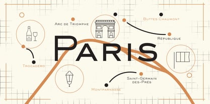
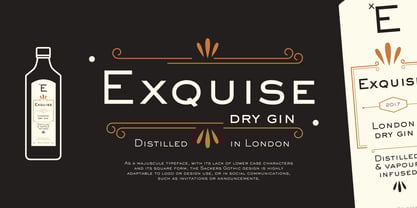
Sackers Gothic is part of the larger Sackers series, a collection of fonts drawn from templates for producing engraved stationery and social cards by Gary Sackers, a Charlotte, North Carolina intaglio printer. Many typefaces were made from similar sources, including Monotype’s Engravers series, as well as Jim Spiece’s ITC Blair, and Mark van Bronkhorst’s Sweet Sans. Sackers’ typefaces, which were initially made into photo-set type, were digitized by Compugraphic and released in the late 1980s. Sackers Gothic has since become a popular choice for conveying sincere and plainspoken language on dust jackets, posters, and of course, in stationery. The face pairs well with display faces of a disparate nature, and serves as a ready foil for anything requiring an air of typographic sophistication.
Designers: Monotype Studio
Publisher: Monotype
Foundry: Monotype
Original Foundry: unknown
Design Owner: Monotype
MyFonts debut: Dec 12, 2001
Sackers Gothic™
is a trademark of Monotype Imaging Inc. and may be registered in certain jurisdictions.
About Monotype
The Monotype Library is one of the world’s largest and most comprehensive collection of typefaces, featuring original designs of historical importance and a fresh range of contemporary and fashionable fonts. The Monotype Library includes thousands of timeless classics, hand-crafted revivals and original designs from many of the most innovative type designers and foundries in history. This distinctive, award-winning library of premium fonts provides brands and designers with a broad and reliable selection of typefaces for expressive typography in print and on screen. The Premium Foundry page can be viewed Here.
Read more
Read less
- Choosing a selection results in a full page refresh.