Using Tabs in Text
When designing and composing text, it is occasionally necessary to line up certain elements, in order to help organize information. This often involves the use of tabs, which will both indent and align specific content. Setting up customized tabs ensures consistency and also allows for quick, easy adjustment to revise or fine-tune their positioning.
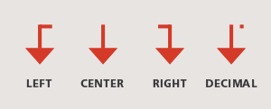
Tabs are available in several alignments:
- Left: The most common kind of tab, where text is left-aligned (or, left-justified) to the tab stop.
- Center: Text is centered at the tab stop position.
- Right: Text is right-aligned to the tab stop.
- Decimal: Text (usually numerical) is aligned to the tab stop on the decimal point. This is especially useful when values shown do not all have the same number of places to the right of the decimal. Some software allows the user to modify this tab to align on another specified character, such as a comma.
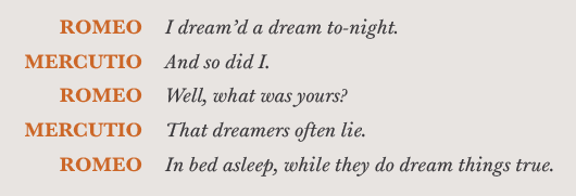
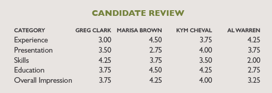
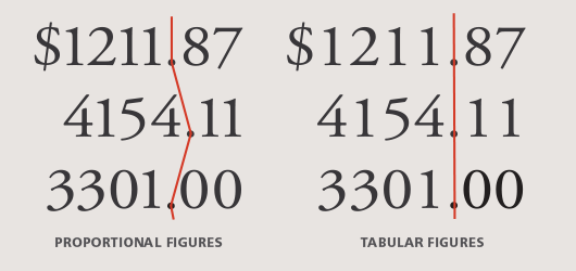
Tab stops are useful in typesetting both words and numbers. They can help organize columns of information in charts, graphs and lists, as well as align figures in annual reports, invoices and price lists, including menus. Tabs are widely used to set paragraph indents as well as hanging indents, also called outdents (although many would argue that the proper way to do this is with the First Line Indent feature of your software). In any case, setting customized tabs is always preferable to simply using your software’s built-in tab stops, which are usually set to half-inch intervals by default. Note: When using tabs for columns of figures, be sure to use tabular figures (link to https://www.fonts.com/content/learning/fontology/level-3/numbers/proportional-vs-tabular-figures) as opposed to proportional figures, so that each column (tens, hundreds, thousands and so on) aligns properly. (C, D)
Tabs can be set either by typing in a specific numerical value, or by manually dragging the tab symbol to the desired location. Once set, tabs can be quickly and easily altered by either of the above methods. They can even be changed from one alignment to another. Setting up tabs can be a bit complex to master, especially with multiple columns, but proficiency with this important feature provides essential options for communicating your information clearly, tastefully and professionally.

- Editor’s Note:Ilene Strizver, founder of The Type Studio, is a typographic consultant, designer and writer specializing in all aspects of typographic communication. She conducts Gourmet Typography workshops internationally. Read more about typography in her latest literary effort, Type Rules! The designer's guide to professional typography, 4th edition, published by Wiley & Sons, Inc. This article was commissioned and approved by Monotype Imaging Inc.