About Barbou Font Family
Barbou was originally cut in 1925 by Monotype as a counterpart to Fournier, siblings that were different in design but both based on the work of Pierre-Simon Fournier. Whether by choice, accident or oversight, Fournier was preserved digitally, and Barbou was lost to history.
Barbou was notably used by Stanley Morrison, in particular as the face of The Fleuron. I fell in love with Barbou when I saw it, and knew that I wanted to bring it to a new generation of designers and readers.
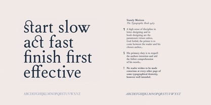
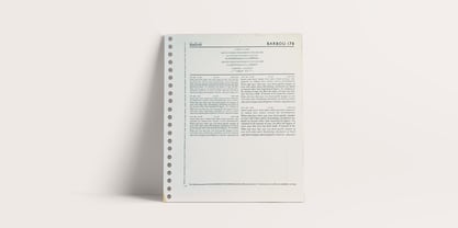
This is a revival of Barbou, a faithful recutting with new weights, characters and many of the best features that modern font technology brings. Particular attention was paid to the original Monotype Barbou 178 specimen sheet.
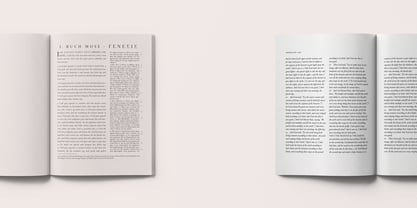
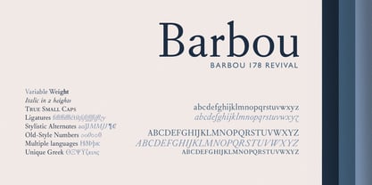
Originally only available in a single weight, Barbou has been recut with a variable weight, providing a large degree of flexibility between Regular and Bold. Barbou excels as a comfortable reading face for books, and the variable weight allows you to fine tune the darkness and texture of the page in a way never before possible.
Barbou has a distinctive softness, and this revival of Barbou preserves much of the effect the medium of metal type had on the letterforms. This results in a subtly rounded yet defined type, elegant not worn, with the utmost attention and respect to the smallest of details.
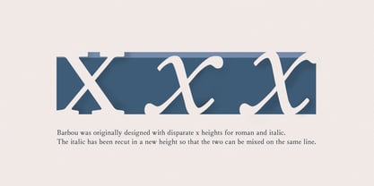
Barbou was originally cut with disparate x-heights for roman and italic, and this revival of Barbou features both the original italic, as well as a new italic redesigned at the same height as the roman. In Fournier’s time, roman and italic would not be mixed on the same line, but the type must change to meet the needs of a new generation.
Barbou also features unique ligatures and alternates, old style numbers, small caps and a full Greek alphabet.
Barbou is perfect for books and anywhere a comfortable reading face is required, and excels in flexibility.
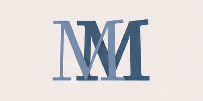
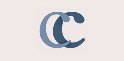
Barbou
About Besnowed
Besnowed is a creative design company passionate about everything typographic - especially books and Bibles - working in a perfect tension between tradition and innovation. Besnowed was founded by Rory Snow in 2020, with the goal of designing content that is clear and beautiful.As a typographic designer, Rory aims to echo Beatrice Warde's philosophy in his work; "Everything about it is calculated to reveal, rather than hide the beautiful thing which it was meant to contain."
Read more
Read less