About Kernig Braille Font Family
This font is the younger sister of HexBraille with which it may be combined to create new patterns. This also explains why their introductory text are similar.
Introduction
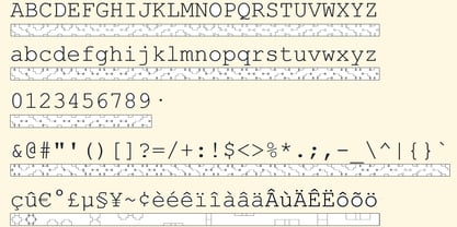
The purpose of this monospace font is to display braille in an original and "steganographic" way. The Kernig prefix means "Robust" in German, this is because of the crank shapes . The core of the glyph design is a flat hexagon which can be read as 3 rows of 2 dots (i.e. regular braille glyph grid).
Even if within a glyph, braille dots ("square dots" indeed) are placed on the vertices of a flat hexagon, the difference with HexBraille is that edges connecting vertices are not straight lines but "crank shapes" instead.
This can be summarized by saying that the whole glyph is a Hexcrank (a flat hexagon where vertice pairs are connected by a crank shape)
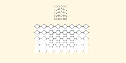
NB: The initial design is illustrated by glyphs 'ç' (no dot) and 'û' (6 dots) as shown by poster 6.
A. "Kernig Lattice"
In KernigBraille, glyphs are connected to each other, thus for each Hexcrank glyph there are 6 connections: 2 on left/right and 4 on top/bottom.
In the final design some cranks were removed for esthetical reason (i.e. leave empty space for allowing patterns diversity).
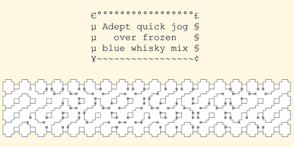
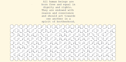
In summary, a text using this font won't display a honeycomb but a lattice instead.
NB: Please notice that in order to obtain the lattice without vertical gaps, you must set the interline to 0.
The lattice is made from 3 kind of shapes:
a.1. Hexcrank
a.2. Square
a.3. Irregular cross (mostly unclosed)
The design favored squares over crosses. The whole slightly resembling a PCB.
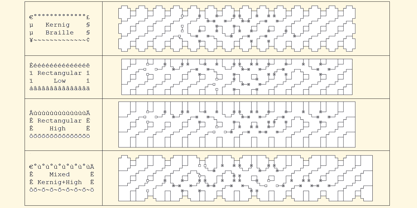
B. Text Frames
It's possible to frame the text with 4 sets of frame glyphs (as illustrated by poster 2)
b.1. Kernig { € ° £ µ § ¥ ~ ¢ }
b.2. Rectangular-High { è é ê ï î à â ä }
b.3. Rectangular-Low { Â ù Ä Ê Ë Ô õ ö }
b.4. Mixed Kernig+High: a mix of Kernig and Rectangular-High frame glyphs
When using frame glyphs, it is advised to show Pilcrow (¶) and Non Breaking Space, which are replaced by empty shapes in this font (e.g. in Microsoft Word, use CTRL+8 or use [¶] button in the ribbon).
Kernig Braille
About Echopraxium
Echopraxium foundry makes unconventional typefaces e.g:
* Decorative / Steganographic Braille typefaces (e.g. Diamond Braille)
* Glyph designed to gather as a lattice(e.g: Hex Braille / Kernig Braille)
* Substitution cypher (e.g. LSPK90H, a Leetspeak variant meant to be read clockwise)
* Anticipated/Foreseen
- Symbols / Icons / Tesselation / Colored typefaces
- Non Roman / Antique / Scifi / Fantasy alphabets
\\//_Dif-tor heh smusma (LLAP: “Live long and prosper”)
Read more
Read less