Select this license type when you are developing an app for iOS, Android, or Windows Phone, and you will be embedding the font file in your mobile application's code.
Dirty Sundae
by Fenotype
Individual Styles from $19.00
Complete family of 4 fonts: $35.00

Dirty Sundae Font Family was
designed by
Emil Karl Bertell and
published by
Fenotype. Dirty Sundae contains
4
styles and family package options.
More about this family
- Aa Glyphs
-
Best ValueFamily Packages
- Individual Styles
- Tech Specs
- Licensing
Per style:
$8.75
Pack of 4 styles:
$35.00
About Dirty Sundae Font Family
Dirty Sundae is a casual hand drawn typeface with interlocking ligatures.
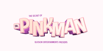
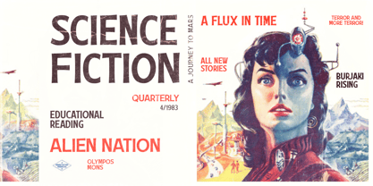
Dirty Sundae comes in four styles: Regular and Condensed plus Regular and Bold version of them both. Dirty Sundae suits great into a film title, as a logotype for a cartoon or an animation film or for a new superhero, as well as in a jazz gig poster, magazine, packaging and branding. It can be easily fit into a vintage or modern context as long as it’s on the cheerful side.
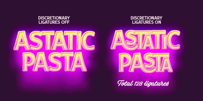
Dirty Sundae is equipped with 128 interlocking ligatures that you can access by turning on Discretionary Ligatures in any OpenType savvy program or by fetching them manually from the character window.
Designers: Emil Karl Bertell
Publisher: Fenotype
Foundry: Fenotype
Design Owner: Fenotype
MyFonts debut: Feb 16, 2021
Dirty Sundae
About Fenotype
Emil Bertell has done it all. Having published his first font files at 16, he was considered to be an international free-font hero while still in his teens. He went on to attend design college, drop out, and become a well-known graphic designer and illustrator. Now one of the most successful type designers from the Nordic countries on MyFonts, the Finland-based designer said in his Creative Characters interview that he’s “had an obsession with visual culture from the beginning.” Before turning his attention to type design full-time, Emil had a very successful career as an award-winning illustrator. “Illustration became my main livelihood,” he said. “I drew painstaking pencil illustrations for magazines, advertising, stamps, etc. I often designed my own fonts for festivals and hand-drew the lettering posters; I also did a few pencil illustrations based on lettershapes, and that got out of hand, so I had to do a lot more of them.” In 2012 he finally made the switch and committed all of his time to type design. Emil first saw success with his Billboard typeface. “It became my first Rising Star on MyFonts and made me realize that I could actually make a living by designing fonts,” he said. “I realized that there’s actually a market out there that I could become a part of.” Throughout the rest of that year he began to see even more success. It began in January, when his font, Mishka, was featured in our Most Popular Fonts of 2011 list. He went on to find a way to bookend the year and was listed among the Most Popular Fonts of 2012 with his Mercury Script design. Since then, his foundry’s success has continued on with best sellers like Voyage and The Carpenter. Fans of the foundry have a lot to look forward to in the near future. Emil will continue to produce beautiful scripts (some coming soon to MyFonts!) and has plans to expand his business.
Read more
Read less
- Choosing a selection results in a full page refresh.