Jim Parkinson is the founder and sole employee at
Parkinson Type Design.
Jim was one of the designers who worked on
ITC Bodoni, along with
Sumner Stone,
Holly Goldsmith and Janet Prescott Fishman.
He designed
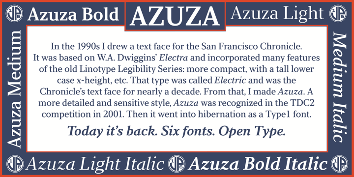
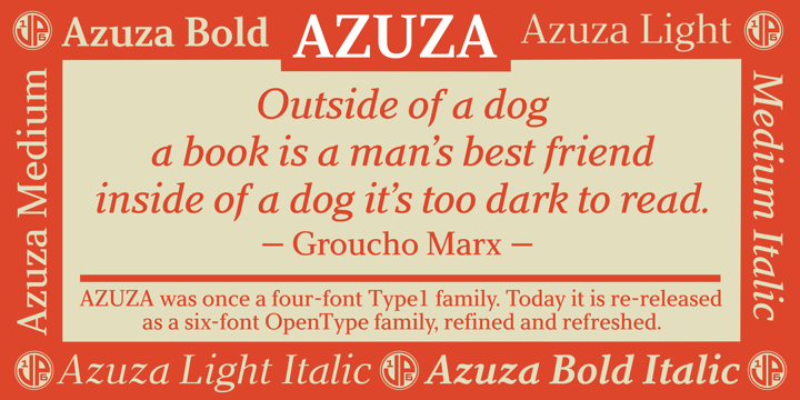
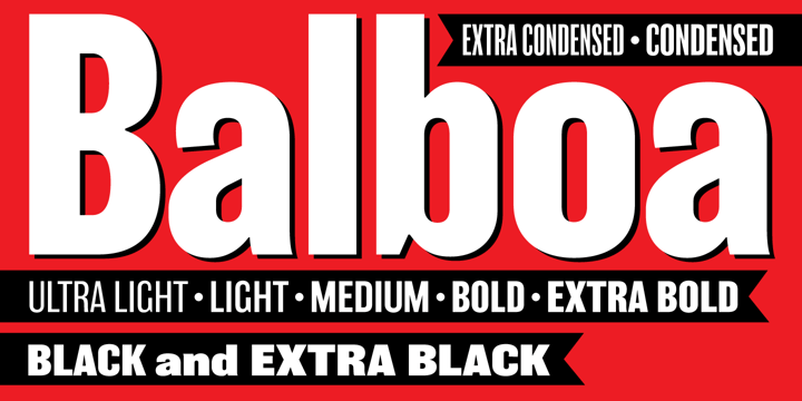
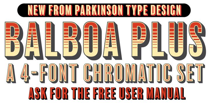
Parkinson Electra for Monotype and has done a number of custom fonts for magazines and newspapers. In addition to his custom font work, Jim has designed dozens of retail fonts. Some of these designs are exclusives for
Adobe,
Monotype,
FontShop, and
The Font Bureau. The rest are released through Parkinson Type Design.
Jim has also specialized in typographic logos for magazines and newspapers, including
Rolling Stone,
Newsweek,
Esquire,
InStyle,
Men's Journal,
Los Angeles Magazine,
Atlanta Magazine,
The Wall Street Journal,
The Los Angeles Times,
The Detroit Free Press,
Chicago Magazine, the
Toronto Star and
The National Post.
In a rare departure from publication work, Jim designed the logo for the Ringling Bros. and Barnum & Bailey Circus. In his spare time, he paints…mostly pictures that feature letterforms.