Typesetting Mysteries, Part 1: Unexpected Line Breaks and Missing Fonts
by Ilene Strizver
The advent of digital typesetting has, for the most part, been a boon to graphic designers everywhere in terms of speed, convenience, and control. Unfortunately, along with its advantages occasionally come some sneaky snags that can create speed bumps in an otherwise productive and gratifying workflow.
Two typesetting tribulations are “demystified” in this first installment of an ongoing periodic series. Over time, we intend to shed light on the most common of unpredictable and seemingly inexplicable occurrences in digital typesetting:
Mysterious line break changes
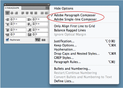
Have you ever tried to make manual line breaks in Adobe® InDesign® to improve a rag, and then discovered, to your surprise (and frustration), that other line endings in the paragraph have changed without your consent? The explanation (and the fix) is rather simple, and relates to an InDesign feature called Adobe Paragraph Composer.
This feature, located off of the Paragraph palette, attempts to optimize line breaks and hyphenations by analyzing several lines at a time. It works well until you make manual edits; once you do, the application recalculates the line breaks in that paragraph, and often reflows text in lines unrelated to your edits. The fix is to select or highlight the text box or paragraph in question and select Single-line Composer Adobe, which will allow you to make edits without affecting any other line endings.
Paragraph Composer is enabled by default. If you use manual line breaks on a regular basis to fine-tune rags, you might want to reset the default to Single-line Composer instead. This leaves you in charge and prevents the application from doing too much thinking for you. (Read more about Change those defaults!)
Mystery missing fonts
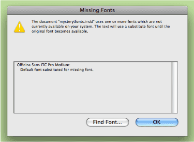
Upon opening an existing document, have you ever been prompted for fonts that are not used in the document? …or have you ever found unused fonts listed in the Fonts in Use / Usage directory of your document? Three possible reasons for this are:
- You have changed a font somewhere in the document, but did not include all the related line spaces and character spaces, both of which hold font attributes. Don’t forget to select the pilcrow, the end-of-paragraph sign, which also holds formatting attributes.
- You have unused, formatted text located outside the live area, which uses the “mystery font(s).”
- The mystery font appears as a default in either the Character or Paragraph Style sheet, or in overflow text, which is also unseen. (It might even be a version of Times which is no longer in your operating system).
Several solutions are available: you can locate and change the mystery font in the actual text or in the font directory. If the mystery font appears in a Style sheet (which can result in a mystery font even if you are not using Style sheets), you can change it there.
NOTE:
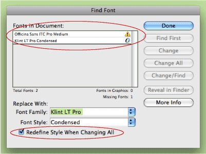
When changing a mystery font in the Font Directory in InDesign, make sure to select Redefine Style When Changing All at the bottom, to prevent the problem from reoccurring when you reopen the document.

- Editor’s Note:Ilene Strizver, founder of The Type Studio, is a typographic consultant, designer and writer specializing in all aspects of typographic communication. She conducts Gourmet Typography workshops internationally. Read more about typography in her latest literary effort, Type Rules! The designer's guide to professional typography, 4th edition, published by Wiley & Sons, Inc. This article was commissioned and approved by Monotype Imaging Inc.