Glyph Palettes
by Ilene Strizver
Every new version of software comes with a fresh supply of bells and whistles. Sometimes the improvements are so subtle we barely take notice of them; other times they’re major additions that can save time and effort, and even make your design tasks more fun!
One recently added feature that you don’t want to overlook is the glyph palette. It’s one of those great ideas that’s conceptually simple and yet can make your job much easier.
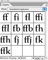
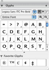
A glyph palette is a user-friendly, easily accessible character map of all the glyphs in a typeface. It shows you at a glance exactly which characters are included in a font. What’s more, it allows you to insert any of them into your document with a single click.
The glyph palette is especially useful when working with OpenType fonts, which can have character sets numbering in the thousands. Can’t find the register, trademark symbol or em-dash? Find it in the glyph palette. Don’t know if the font you’re using has a Euro symbol, fractions, or a particular foreign language character? Use the glyph palette to check it out.
Both Adobe InDesign and QuarkXPress offer glyph palettes. These palettes can display an entire font at once, or you can use the dropdown menu to view subsets of the character set (ligatures, alternates, small caps, etc.). You can access other weights or fonts and even enlarge or reduce the showing, right from the palette. Want to insert a glyph in your document? Easy: just insert the cursor or highlight some text, then double-click on the glyph. It’s as easy as that!

- Editor’s Note:Ilene Strizver, founder of The Type Studio, is a typographic consultant, designer and writer specializing in all aspects of typographic communication. She conducts Gourmet Typography workshops internationally. Read more about typography in her latest literary effort, Type Rules! The designer's guide to professional typography, 4th edition, published by Wiley & Sons, Inc. This article was commissioned and approved by Monotype Imaging Inc.